Table of Contents

Choosing the best font for business cards isn’t just about visual appeal—it’s a key part of your brand identity. A carefully selected business card font can help build trust, communicate professionalism, and make your contact details easy to read at a glance. In today’s fast-moving world, your business card must leave a lasting impression in just seconds. The right font for business cards not only complements your logo and design but also enhances readability across various print formats. Whether you’re a designer, entrepreneur, or corporate professional, selecting good fonts for business cards can directly impact your brand perception. Let’s explore the best picks, sizes, and styles for business card fonts that truly stand out.
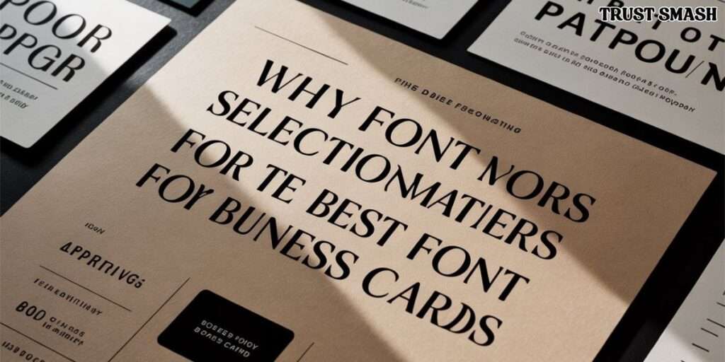
Why Font Selection Matters for the Best Font for Business Cards
The best font for business cards serves as the first impression of your brand’s personality. A well-chosen business card font can convey professionalism, creativity, or approachability, setting the tone for potential clients or partners. Conversely, a poor font choice can make your card appear cluttered or unprofessional, potentially deterring interest.
In the competitive U.S. market, where first impressions are crucial, the typography on your business card can significantly influence how your brand is perceived. It’s not just about aesthetics; it’s about aligning your font choice with your brand’s values and the message you wish to convey.
Key Elements of an Effective Business Card
An effective business card is more than just contact information—it’s a reflection of your brand’s identity. Essential elements include your name, job title, company name, phone number, email address, and website. The business card font plays a pivotal role in presenting this information clearly and cohesively.
The layout should ensure that each piece of information is easily accessible, with a hierarchy that guides the reader’s eye naturally. The choice of business card fonts should complement the overall design, maintaining balance and readability.
Serif vs. Sans-Serif: Which Font Type Works Best?
When selecting a business card font, understanding the difference between serif and sans-serif fonts is crucial. Serif fonts, like Times New Roman and Garamond, feature small lines or extensions at the ends of letters. These fonts often convey tradition and formality, making them suitable for industries like law or finance.
On the other hand, sans-serif fonts, such as Helvetica and Arial, lack these extensions, offering a cleaner and more modern appearance. These fonts are versatile and widely used across various industries, providing a contemporary feel that appeals to a broad audience.
Top 10 Fonts for Business Cards in 2025
Selecting the right business card font is essential for making a lasting impression. Here are ten top fonts to consider in 2025:
- Helvetica – A timeless sans-serif font known for its clean lines and versatility.
- Garamond – A classic serif font that exudes elegance and readability.
- Futura – A geometric sans-serif font offering a modern and sleek look.
- Avenir – A sans-serif font with a humanist touch, providing warmth and clarity.
- Baskerville – A serif font that combines sophistication with readability.
- Roboto – A modern sans-serif font designed for digital and print use.
- Montserrat – A contemporary sans-serif font with a bold presence.
- Lato – A sans-serif font that balances professionalism with a friendly tone.
- Bebas Neue – A sans-serif font known for its bold and impactful design.
- Playfair Display – A serif font that adds a touch of elegance and style.
Each of these fonts offers unique characteristics that can align with different brand identities and industries.
Best Font Combinations for Business Cards
Combining fonts effectively can enhance the visual appeal of your business card. Pairing a serif font with a sans-serif font can create a balanced and harmonious design. For instance, using Baskerville for your name and Helvetica for contact details can establish a clear hierarchy and improve readability.
When selecting font combinations, consider the tone of your brand and the message you wish to convey. Ensure that the fonts complement each other and do not compete for attention.
Ideal Font Size and Formatting for Business Cards
The business card font size is crucial for ensuring readability. The standard font size for business cards typically ranges from 8pt to 12pt, depending on the amount of information and the font style. For instance, your name might be set at 12pt, while contact details could be at 8pt to 10pt.
Proper formatting also involves adjusting line spacing, kerning, and alignment to create a balanced and professional appearance. Avoid overcrowding the card with too much text, and ensure that there is adequate white space to allow the design to breathe.
When (and Where) to Use Script Fonts
Script fonts can add a personal touch to your business card, making it feel more bespoke. However, they should be used sparingly and in appropriate contexts. For example, a script font might be suitable for a wedding planner’s business card but less so for a corporate attorney.
When using script fonts, ensure that they are legible and do not compromise the overall readability of the card. They should complement the primary best font for business cards, not overshadow it.
Common Font Mistakes to Avoid
Avoiding common business card font mistakes can prevent your card from appearing unprofessional. Some pitfalls include using too many different fonts, choosing fonts that are difficult to read, and selecting fonts that do not align with your brand’s identity.
It’s essential to maintain consistency across all branding materials and ensure that your best font for business cards reflects the values and personality of your brand.
Fonts and Branding Consistency
Consistency in the best font for business cards reinforces your brand identity and creates a cohesive visual experience. The fonts used on your business card should align with those used on your website, social media profiles, and other marketing materials.
Maintaining font consistency helps build brand recognition and trust with your audience, ensuring that your brand presents a unified image across all platforms.
Designing Business Cards for Different Industries
Different industries may require different approaches to selecting the best font for business cards. For example, a creative agency might opt for bold, modern fonts like Futura or Montserrat, while a law firm might choose more traditional fonts like Times New Roman or Garamond.
Understanding the expectations and norms within your industry can guide your font choices, ensuring that your business card resonates with your target audience.
Where to Find Quality Business Card Fonts
There are several reputable sources where you can find high-quality fonts for business cards. Platforms like Adobe Fonts, Google Fonts, and DaFont offer a wide range of options, both free and premium.
When selecting a font, ensure that it is licensed for commercial use and compatible with your design software. It’s also advisable to test the font in various sizes to ensure readability and aesthetic appeal.
Final Design Tips & Tools for a Pro Look
To achieve a professional-looking business card, consider using design tools like Canva, Adobe Illustrator, or Vistaprint. These platforms offer templates and customization options to help you create a card that aligns with your brand identity.
Remember to keep the design simple and focused, using your chosen business card fonts effectively to convey your message. Pay attention to details like alignment, spacing, and color to ensure a polished final product.
In conclusion, selecting the right business card font is a crucial step in creating a memorable and professional business card. By understanding the nuances of font selection and applying best practices, you can design a card that effectively
FAQS (Frequently Asked Questions):
What is the best font pairing for business cards?
Baskerville and Helvetica make a strong pair—combining classic style with modern clarity.
What font is most eye catching?
Montserrat grabs attention with its bold, modern style while remaining highly readable.
What’s the best font to use for a business card?
Helvetica is the best font for business cards due to its clean and professional look.
What is the most attractive business font?
Garamond is considered one of the most attractive business fonts for its elegance and readability.